Tuesday, 22 November 2011

Research; Mitch Epstein

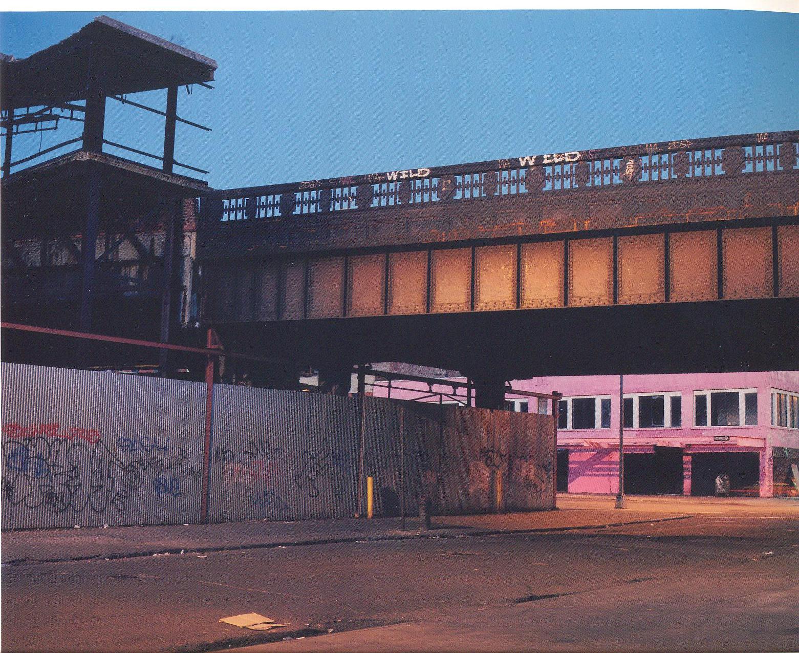
These pictures caught my eye as this concept of 'Urban Photography' interests me. The graffitti on the structured layout of this Town/City reveals that people were once here but for the time being this place is abandoned.
The colours and lighting of this image I think gives the photo character and is quite interesting as this image make you want to find out more.


I found this image really interesting. You can just make out on the bottom left of the image that the camera angle overlooks the City, whilst the fog whitens and blurs the background and middle-right view of the image.
The clearly defined cameras suggests that although we may not fully see and understand the City, they (as in the cameras) see everything. They know exactly what's going on.


This photo shows the abandonment and run-down areas that you may come across, which were once booming with business and filled with people.
The bright lighting could suggest hope for this place and that there is still life within it.
With the chairs and tools on the floor, some may assume that the workers just left and this is how the City has changed on it's own without human interraction.


This image reveals the typical structure of buildings within a City. - Lots of offices with lots of windows.
Due to only just being able to see some people in the offices, this photo gives the viewer a kind of spying or peeping feel to it as that may not know someone's looking in.
The different colours of the offices suggests different things. - The cold blue tones to the offices may reveal that there is no one in there. They have all sneaked off home.
Undereneath this, the offices hsve a peachy tone, suggesting warmth and friendlyness between the offices.
Then the bottom-right two offices look very cosy and warm due to the yellowy/orange feel to it.

With these images, I would like to interpret the idea of documenting the goings-on of the City within my work. Capturing the character of the streets, like the various colours and graffiti, and the abandoned streets which may be busy by morning.
I also like the idea of capturing and documenting the run-down abandoned areas where lots of people once were, revealing how the City has changed and is currently always changing.

Deconstructing Environmental Photographers

The Flatiron Building, or Fuller Building, as it was originally called, is located at 175 Fifth Avenue in the borough of Manhatten, New York City and is considered to be a groundbreaking skyscraper. Upon completion in 1902 it was one of the tallest buildings in the city and the only skyscraper north of 14th Street. The building sits on a triangular block formed by Fifth Avenue, Broadway and East 22nd Street, with 23rd Street grazing the triangle's northern (uptown) peak.
As the French celebrated their Eiffel Tower, so did the Americans regard the Flatiron Building as the icon of the city being modernized and to be celebrated resulting in many different photographs of the building.


Edward Steichen, 'The Flatrion, New York', 1905.


When looking at this image, it makes you feel as if you're peering through the branches or have just looked up and discovered this huge building. This idea of discovery links to the concept of the people discovering that they could build much greater buildings/skyscrapers.
'The Flatrion' picture was taken left of the building and is central to the rest of the image. It has a large depth of field  meaning they used a small aperture. The sky background of this image feels as if it could have been taken in the early morning or early evening, where it was possibly foggy or raining.
The image has a sepia effect which could be down to the film or print choice, or maybe this could have been taken at maybe sunset to give this warm, orange-like glow effect of light.


Alfred Stiegitz, 'The Flatiron', 1903.

The building fits half of the frame in the photo and looks as if it was taken on a cold, maybe frosty day.
I think the tree and bushes are included in this photo to give the image character and to scale just how big the building actually is.
I'd say the film used, had a high ISO as the photo looks a bit grainy and a low aperture as the image doesn't have a lot of focus apart from the tree in the foreground which looks quite close to the camera.
This image also doesn't have a lot of tonal range.
I think the photographer intended to show that the new building is fitting or has fitted into the city landscape, due to it blending into the bushes.


Alvin Langdon Coburn, 'The Flatiron Building', 1911.

This image has been taken with the building slightly on the left of the photograph. The building looks a sort ot triangular shape at the top, similar to Edward Steichen's work.
I think this photographer captured the people to show just how busy the streets get and how many people see and may use the building. By having people in this image, it gives a scale as to just how tall this building really is. 
The tonal range and sepia effect to this image is also very similar to Edward Steichen's work, even with the composition of the branches and trees.


Walter Gropius, 'The Flatiron Building, New York', 1928.

The most obvious thing about this photo is that the building looks as if it is leaning. This may be due to the photographer not changing the perspective control on the camera.
The building has a fair bit of detail which could be the result of using a high aperture and a film with a low ISO.
This image is mainly mid-tones and looks quite grey.


Walker Evans, 'Flatiron Building seen from below, New York City', 1928-1929.
This image has a variety of tones, but they seems to be in different blocks. For instance, the block of black in the foreground against the light grey-white sky shows a lot of contrast, whilst the building in the center of the image has mainly mid-tones of grey.
The way in which we look up at the building gives the emphasis that the building is really great.
The image seems very structured with everything in its place and it almost looks as if the photographer and us viewers are looking up at the building, out of some sort of hole, in the way that the different elements within the image frame the building.
The way in which we can only see a part of the building, which has a block of black in the foreground is similar to the work of Alfred Stieglitz.


Berenice Abbott, 'The Flatiron Building', 1938.
This photo looks very structured with the straight lines of the buildings. With this, and the way in which we look up at the building taking note of the detail, is similar to the work of Walker Evans.
The way in which the building is the main focus point, taking up most of the frame with a lot of sky as the background is similar to the work of Walter Gropius. - Also by the distance from the building at what this image was taken at.
This image only has detail at the front of the building whereas further back on the building towards the background, becomes out of focus. - Meaning that the image has a large depth of field. 
Wednesday, 16 November 2011

Brief & First Ideas

To make a Portrait of either an individual from the local community who lives or works in the Medway towns, or a member of Staff or a Student from another course, from University of the Creative Arts.

- They have to be unknown to you
- Must be shot in a studio
- Black & White
- Medium or Large Format


First Ideas / Scribbles & Notes;

Wednesday, 2 November 2011

Printing; Image 3

5 second test strip on G3;


5 second strip;

10 second strip to compare;

I felt that 5 seconds was best as I could add grades to darken areas of the image to how I wanted a lot easier than trying to lighten areas.

I also wanted the image to have a sky to it, so I done a 5 second step wedge on G1 as I didn't want the sky too dark;

The 10 seconds looked best. Any longer would be too dark


I then tested the sky at G1 for 10 seconds with the rest of the image being exposed at G3 for 5 seconds, with the added 2 seconds of G5 and G0;

I was pleased with this, so made a full print;

Printing; Image 2

5 second test stripon G3, Aperture f16;
20 second strip;

This was too dark so I tried G2 and G1 each for 20 seconds to test the result;

After testing numerous amounts of grades with different burning in techniques that I threw away because they were no good at all, G1 for 20seconds overall was best. So I made a large print of this;


Printing; Image 1

I first done a test strip on Grade 3 for 5 seconds;

5 seconds was best;

I thought 5 seconds made the image too dark so I tried 3 seconds;

This made the image really dull and grey. I wanted some contrast in there so I tried adding G5 for 2 seconds;

This was a tad too dark so I tried G3 for 3 seconds and G5 for only 1 second;

This made the image too light. I liked the greyness of the sky and the subtle tones in the sand but the buildings looked flat and boring.

I now tried G3 for 3 seconds overall and added G5 for 2 seconds, but only on the buildings and central area;

I was happy with the middle but felt the sand was now too dark.
So I made a full print using G3 for 3seconds overall and G5 for 2 seconds on the buildings, whilst blocking the sky and sand with my hands;

Printing; Object Shoot

Test strip of 5 seconds with an aperture of f11. Magenta - 80. Yellow - 60;

5 seconds was best so I made a full strip;

This looked too yellow and a bit green, so I altered the magenta and yellow both to 60.

The black at the bottom of the image was too light. So I made another exposure of 5 seconds, but this time I exposed the bottom for another 5, whilst blocking the rest of the image from light.

I was really pleased with this image, but the medal in the central foreground and the meat next to it, looks blurred and out of focus, which I wasn't happy with.

I then chose another image of the same compostition that had more depth of field to it to try.

For this image I kept the aperture the same at f11. Also, because this was taken using the same lighting and everything else, I kept the Magenta and Yellow both at 70 as before, whilst doing a 5 second step wedge.

Like before, 5 seconds was best, so I made a full strip of this.

I was happy with the colours so I made a full print;

I was really happy with the colours and focus, but the bottom blacks of the image needed to have more exposure to be darkened.
I then made another print of 5 seconds, but exposed the bottom black area for a further 5 seconds whilst blocking the rest from light;

Printing; Pastiche

After looking through my negatives, I decided on my favourite image and started to print.

First I done a 5 second test strip on Grade 5 as I wanted my image to have contrast.
The aperture was set to f8.

The middle image was a test of G5 for 25 seconds, which I thought was too dark, so for the second test i done G5 for only 20 seconds. 


- G5 for 18 secs; Which I printed in full to see the different areas of the image.


I then tested;
- G5 for 18 secs & G0 for 10 secs.
- G5 for 18 secs & G0 for 5 secs.


- G5 for 20 secs & G0 for 8 secs. > To get the contrast and all of the tones on the cliff i used G5 whilst blocking out the sky so it wasn't bleached. Then to get the sky, clouds and sea in the image, I used G0 whilst blocking out the cliffs. I kept my hands moving and as close to the lens as possible to avoid getting lines.
 
Full print;
I was really pleased with this effect. It showed the Contrast, midtones and sea/sky that I wanted. But I changed the size of my image to a square shape instead..

I felt this looked better and fitted the pastiche more.

Thursday, 27 October 2011

My Object Shoot

For my first and main idea, I chose to use a Union flag in the background without making it a focus point. I felt by having a flag in the background it would link more to my subject and theme, and give my photo more character.
I chose to use my Uncle's medals and ornament as a part of my image as he himself was in the Army, so I felt this really supported my visual aspect of my opinionated project.
I used a white candle within my image as I read whilst researching that it represents spiritualiy. This linking to the lives lost during the War.
I shot this image without lighting the candle as I have not yet tried photographing a naked flame. If I was to do this shoot again, I would definately research into what a lit candle represents and how to photograph it.
The meat links to my personal opinion, that the British soldiers (linking to the flag) should not be out fighting in Afghanistan. And at the beginning of this war, they were sent out there, or thrown, like peices of meat.
The splashes that looks like blood was actually meat marinade which my local butcher was kind enough to give me.

I wanted this image to be quite dark and have a soft spotlight, concentrating entirely on my objects.
So to do this shoot, I used a black felt material as a base for my objects to absorb any light.
I used the black side of a foam board on the right of my image whilst a broncolour light on the left.
To help achieve this soft spotlight effect I also used a 'honeycomb' on the light.

The camera I used was a Horseman 5x4, loaded with large-format, colour film with an ISO of 160. I also used a 120mm lens.

First Idea;
To achieve the first shot, I used an aperture of f16.5, but only because I accidently nudged it whilst cocking the shutter. The QuickDisc said to allow 0.7, so I upped the broncolour to 8.3.

I now made the second exposure (Bottom image above) keeping everything the same but making sure the aperture was on f16.


After carefully looking at my negatives I decided that the image looked a little flat. So I used an aperture of f32, but also changed the lens plane (focus) and film plane (perspective) of the camera;


Second lot of images: The only problem I had with this, was that I accidently moved the t-shirt and knocked the badges off, so I had to carefully and precisely recreate a part of my set-up again.


I was rather pleased with the results of these shots, so as I had another darkslide left which was loaded, I decided to try two other of my ideas;

For this image I used a 'United Nations' t-shirt as the background and made it look blood stained, whilst having the meat and more of the blood-like substance in the foreground.
By using the skull infront of the t-shirt, I played around trying to capture all of the highlights and midtones.


For this image, I kept the t-shirt in the background as I felt it gave a good effect. I then threw the meat onto the flag to give some more colour, whilst throwing more blood-like fluid across it. The meat and the marinade started to dry and darken with colour by this time, so I wanted to see whether when printed it would give a different effect.
I also wanted to capture the 'Quality assured England' on the skin of the meat, as a humorous point, but still linking to my theme.