Showing posts with label Workshops. Show all posts

Monday, 19 March 2012

Workshop; Interior Lighting

With this workshop, we built a temporary corner, which we wanted to look like a room, and lit it to practice our fashion set build idea of a dominant female, with a timid male.


We used this to diffuse the light and darken the corner.


For this we practiced using the H1D, as we will use on the fashion project. 

We used these to diffuse the light on the female. The top one diffused light from underneath the eyes to the thigh. We wanted the eyes and front leg to be highlighted to emphasise this idea of a female leaving the man.
The first shot highlighted too much of the brightly coloured leggings, so we added another gobo to lengthen the shadow to mid-shin.

1st Result;

2nd Result;

Wednesday, 29 February 2012

Printing without a Neg.

With this workshop, we were creating images without a negative.
We used rubbish to create different lines, textures and tones using just light and shapes.

We used the same process of testing aperture with a step wedge;
This was created on F11 for 5 seconds;


We then used this process with sterncils experimenting with colours;

This was made on F11 for 5 seconds, which gave no colour apart from black.
I changed the aperture to the smallest one, of F45 and tested it for 5 seconds.

I then created this, experimenting every exposure with the Magenta and Yellow on various settings for 5 seconds each time;

Thursday, 12 January 2012

Life Drawing

This workshop was for us to concentrate on lighting the body. - How the highlights and shadows are formed on the body and what shape is given and made by this.

For the first few quick sketches we used ink;


For the final drawing we used charcoal. We had to concentrate on the shape of the model and what parts were highlighted and had shadows.


Tuesday, 10 January 2012

Body & Lighting

These shoots were to practice capturing emotion and lighting the body in the right way, to help express exactly what we wanted.

Our task was to capture Aloof, Intimacy, Pride and Vulnerability..


Overall, i think i captured these emotions quite well. The first two images (on the right) are out of focus, but in terms of camera position and pose, i think i captured what i wanted.
I was rather pleased with these images as i spent a lot of time adjusting and testing the lighting for each emotion.


For these images below, i was trying to perfect my lighting in preparation for my 'Body' shoot.
I really wanted to get the effect of a favourite image of mine by Irving Penn..


I really liked how the curves and smoothness of her body was defined by the highlights. For my own shoot, i didn't think the strong contrast would have supported my theme, but i did like the effect within this image.
The strong contrast within this image defines her slender frame, and draws attention to her curves and sensuality of the female form.


Thursday, 13 October 2011

Making two images appear the same but with different lenses

For this workshop, we were asked to make two images appear the same whilst using a different lens for each. I used a Horseman 5x4 camera and to take the photos I used a 180mm lens for one and a 210mm lens for the other.


For the black and white image I used the 180 mm
lens.
- Light reading was 5.6, so I turnt the broncolour
box to 6.1 from 6.
- The QuickDisc read 0.6, so I upped the light to
6.7.
I also measured the distance between the objects
and the edge of the photograph by the squares on
the grid.

          For this colour image I used the 120mm
     - I moved the camera back about 1 foot.
                                                                     - The light reading was 8.5.
        - The QuickDisc read 0.6 so I upped the light to 6.
     - The light reading was now 8.4, so I upped  the light 
to 6.3 which then read 8.6 on the light meter.


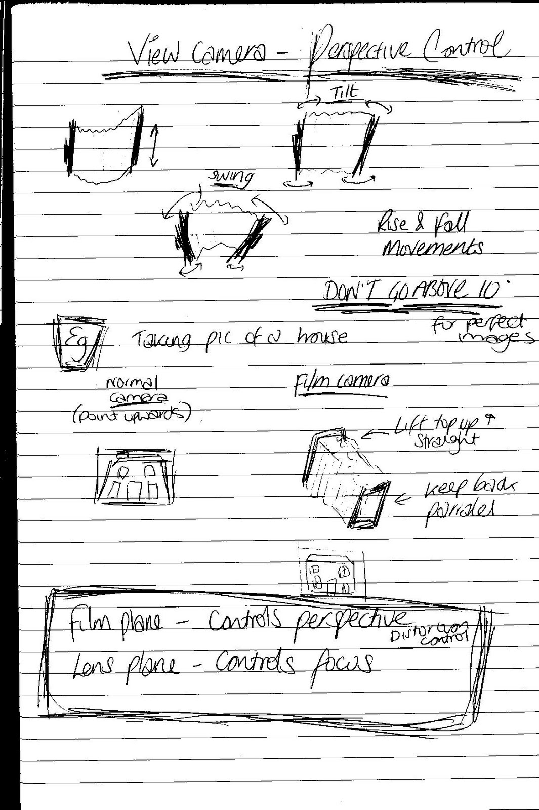
We then took another two photos, but now whilst changing the 'Perspective Control'.


Not that you can see very well from the scan, but below are the negatives from this shoot, for which I used a 210mm lens. One was taking looking at the book straight. (Colour Negative)
The other was taken with a 'Tilt' of +34 degrees and a 'Swing' of 27 degrees. (Black & White Negative)


Wednesday, 12 October 2011

Colour Printing

This process was just the same as the black and white workshop, apart from the obvious differences of changing Cyan, Magenta and Yellow settings.

My first test strip; Cyan - 0. Magenta - 60. Yellow - 80.


I chose to go with 20 seconds light exposure as this looked best..


I thought this looked a tad dark and too cyan, so I lowered the Magenta and Yellow by 5.
I now made a light exposure of 18 seconds with Cyan-0, Magenta-55 and Yellow-75


I was happy with this so I made a large print;


After this large print, I then decided that it was still a tad too dark, so I altered the light exposure to only 14 seconds. (Cyan, Magenta & Yellow kept the same as the previous print)

Wednesday, 5 October 2011

Black & White Print Processing - Self Test

After my assisted workshop of printing, I then changed the negative and decided to give it a go myself.

I first done a 5 second light scale reading. (5, 10, 15, 20, 25)


This was far too over-exposed, so I changed the setting from G0 or G2 to G5...


I then done a test shoot of 10 seconds on both of G0 and G2;


This wasn't what I wanted so I done another test using G0, G2 and G5, with 10 seconds exposure on each, resulting in...


This still wasn't what I wanted, so I done a third test using G0 and G2 with 10 seconds exposure and then G5 for 20 seconds;


After all of these tests, I then finally realised if I changed the aperture from f8 to f11, it may help...

I then got a test shot of;


My A4 print of this;

Black & White Printing Process

After having our introduction to the darkroom and materials etc, we printed our negatives out onto a contact sheet;


After setting up our sections, i.e fixing our lens, putting our chosen negative into the view-finder and created our border sizes etc, we then focused our image and started creating tests on sections of photographic paper to make final choices for our A4 prints.

I first done a test of a light exposure scale of 5 seconds. (5, 10, 15, 20, 25)
I used an opened lens on a G2 scale;


This then tested this scale of 5 seconds again but used f8 and G5;


After choosing the tone I wanted to work with I then then made a test shot of this;

I now started to look at contrast, density and tone. I made varied choices and tests to see the results before making a final decision...

I used G0 and G2 on this for ten seconds each;


I decided I wanted the background darker, more tone in the squares and less exposure in the highlights on the bottom right of the image and object. I now tested the same G. scales but with different times.


I made an A4 print of this to show the image before making further alterations..


I now started to make slight changes..


First try; G0 and G2 for 10secs, then G5 for 10secs..


Second try; G0 for 20secs. G2 for 5secs then G5 for 10secs...


Third try; G0 for 15secs, G2 for 5secs and G5 for 10secs...


I was really happy with this third result so printed this on A4. 

Monday, 3 October 2011

1st Negatives

These are my negatives from a studio shoot. I used constant lighting whilst i tested different apertures and shutter speeds. Some are far too dark whilst others have different tones with good shadows, which i'm pleased with for my first time, using a film camera.


For my second studio shoot using a film camera, I used large format film, testing the results using a broncolour mobile flashpack and unilet flash.


Negative - Black and White; F8.
(Light reading was 6.8. The calculator quick disc i used said to compensate 0.8, so i upped the light to 7.6)


Negative - Colour; F32.
For this i turnt the light down to use a softer light. The flashpack only went to 10 and the quick disc calculator said to compensate 0.6, so I moved the subject closer to the light. This still wasn't enough (32.4) so I moved the subject slightly closer still and widened the aperture for more light (22.8).