Friday, 18 May 2012

Fashion Magazine Research

These images are by David Carson.
I felt these would be useful ideas for our magazine, as they are really intriguing images.
The minimal colours used with a single image and lots of text I found really interesting to look at. 
Some of the styles of text I thought we may be able to use within the magazine.


I felt this would be good for a front cover. I liked the use of the newspaper effect background, which would link to our theme of recycling. I felt the portrait and splash of colour was really dramatic and grabbed your attention.

I feel the coloured text over the black and white images is really effective. We could use this as a beginning of an article.


With the image above on the right, I really liked the text over the image. This could also be a front cover image, or a dramatic start to an article or spread within the magazine.

This image grabbed my attention because it reminded me of my work with the mannequins. - This idea of being broken or seen as no good and being discarded of.

Day of the Shoot!

Everyone was quite nervous and stressed about making everything perfect and going right!
Whilst Cassie & Jaime tested lighting, Edvardos picked up the model whilst I arranged and met the make-up artist and hair stylist. 

We made them both feel very welcome and bought them refreshments before setting them to work.


 The make-up artist was very professional and kept asking whether what she was doing / had done was to our liking. 
We had also stuck up research pictures to remind her of what we were after, as well as pictures for the models to relate to with poses.


With the hair and make-up we were really pleased.
Although the models looked the part and were quite easy to work with for getting them in the correct poses and expressions, the female model was rather difficult overall to work with.

We had a lot of trouble focusing the camera for this soot, and when we did succeed, the model kept moving. In between checking the computer image for focusing, the model kept walking about and coming over to have a look at the image. - Even though previously we had told her that she was welcome to look, but only when we were ready for a different shot.

Thursday, 17 May 2012

Making the Set

We started by attaching out slats together and making A-Frames to stand them up.
After weighing them down, we then lined our corner walls.

Next, we painted one wall with two coats of blue matt paint, before wallpapering our main focus wall.

 After this, we then laid some laminate flooring, but only for the parts that were going to be visible in the shot.

Due to the height needed for the bed and not having tables in uni that were either tall or short enough, we ended up making our own bed frame from old timber!

Our bed with mattress and fitted sheet; 

Starting to put props into place and see what looks best where;

 Testing the lights;

Female Hair & Make-Up Final Decisions

After regular research and contact with the chosen make-up artist and hair stylist, I had a set of images for her to combine into one look. 

For Hair;


I wanted loose curls, that we could ruffle and mess up slightly, with lots of movement.
This look would also relate to the predator theme. - The idea of big fur, movement and perhaps a wild mane.


Make-up;
 With this, I thought dark eyes would be really effective and link to this idea of temptress conquering.
I feel the eye contact with the female model is important, so I really wanted her eyes to be defined.
 I liked this dramatic effect of the eye shadow, so I asked the make-up artist whether she could do something like this but with dark colours.
 I think that big lashes would make the eyes stand out more and give drama.
I loved this eye liner! I thought it was really different and effective and would suit our predator.

Female Model Outfit

After long discussions about the female 'dress', we decided to buy one instead of worrying about designing and getting one made. We wanted something sophisticated and not high street looking. We also wanted one we could put off the shoulder to show a bra strap, to emphasize that she'd just put it back on.

I was originally looking at dresses like the one above, but all were coming in too pricey for our small budget.

I asked whether or not she even needed to wearing a dress.. Or whether she was in her underwear with her dress in her hand ready to put back on.

I then looked into what underwear she could be wearing. I felt that a simple bra and knickers would be too much flesh on show and that all of the attention may be on her body.
I wanted something more classy and less distracting.

I felt that this long-line body with stockings looked much classier and sexier, than a simple bra and knicker set. The idea that less flesh is sometimes more.
I liked this animal print to emphasize this predator theme we had of her, although the leopard print didn't seem quite right considering her original character was a wolf. 


I then found this lace dress from Ann Summers for only £15.
I felt this would work well with a black underwear set underneath.
I also felt that we could make use of the split in the dress, showing her leg poking out in a seductive way. 
The team agreed, so this is what we went with.

Chosen Props for the set

These are the props I shall bring for the set. Most will be under the bed or on the floor. Exact places will be decided on the day.


This is the dimmer lamp we shall use on the bedside cabinet.

These are the sheets to use on and draped over the bed. We chose white to emphasize innocence, purity and virginal connotations of the young lad.

This is the duvet cover we will use to put in the corner. We chose this effect so it was noticeable, but the colours didn't draw attention away from the main subjects.
The black and white also relates to the girl and the guy.

Tuesday, 24 April 2012

1st Lighting Test

For this, we quickly made our set to scale using foam boards and chairs, then started experimenting with light, to get an idea of what we want for our fashion image.


From this, we then realized that we didn't need 3 slats each side. We could in fact get away with only having 2 each side. - Making an 8 x 8 foot set.


We then tested shadows and models with the composition. Because we wanted shadows of their silhouette on the left wall, we used a small light in between the wall and what will be a bed. - This can then emphasize that during the act, a lamp has fallen off a cabinet there.

Pin-Hole

My Camera;


 First Attempt - 4 Mins.

Contact Print;


Contact print.
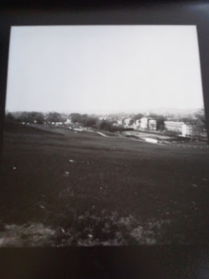
Final Image for Submission. - 15 Min. exposure.

Sunday, 25 March 2012

Appraisel

With my final images, I decided to express the theme of ‘waste’ through Fashion. 
To do this, I looked into how much waste the fashion industry itself produces. - Fashion designers seem to make clothes today to last for a short period of time. New lines of clothing are produced regularly. – Mainly known as the ‘spring/summer’ and ‘autumn/winter’ collections, as well as mid-collections often in between. 
These clothes are what’s seen to be ‘fashion’ and are therefore desired and wanted. Anything made and published before this, i.e. the year before, are considered ‘old’ and ‘out’ of fashion, which makes them unwanted and discarded of. With this, the fashion industry produces more than one million tonnes of textile waste every year. This is without even considering our own garment waste by following this fashion system. – Us as consumers, play to their system and keep buying and discarding of just as many clothes. 
I feel that, we, as consumers, act like the fashion industry’s mannequin, which, just like the clothes, has a use by date. 
For this, I portrayed my model as a mannequin doll thrown out into the rubbish. - I drew lines on my models skin to show the joints of a doll, enabling movement, with old shopping bags surrounding her within a dark, dingy, lonely alleyway. I used doll-like make up, to give her a little identity and connect to us as consumers, playing to the industry’s throw away system. – Half human, half doll. 
To emphasize this, I made my model give a blank expression and lifeless eyes. 
A lot of my inspiration came from photographers such as; David LaChapelle
Due to the way he incorporates models and fashion poses with literal waste. The models somehow look as if they're meant to be in that location. Or, on the contrary, they are dolls which have simply been abandoned and forgotten.

 Tim walker
With the way he literally turns his models into dolls. This is very dramatic, but I like the mechanical poses and the lifeless, non-human look.

 and Tom Hunter.
With this sense of abandonment and sense of uselessness, whilst remaining in an environment we all recognize.

My photos;


Prints;


(Re-Print)


 I printed my images a little dark due to the theme and setting of my photographs. 
I personally, am really pleased with my images and I feel they represent my idea well.
I think these photos would work well in a newspaper,  as they are reflecting on the waste problem issues of fashion, not the glamour side to fashion, like magazines do.